尚略廣告上海logo設計與上海VI設計團隊為您分享羅馬里亞最大房地產(chǎn)公司開發(fā)商IULIUS 公司logo設計與企業(yè)VI設計案例��。

About 背景簡介
(Est. 1991) “With over 20 years of experience,
the IULIUS Company is
the only developer and operator of mixed-use projects in Romania. IULIUS
revolutionized the local real estate market, being a visionary company that
implemented premiering concepts in Romania: the first mall outside the capital
city, Bucharest, and the first mixed-use urban ensemble. IULIUS developed over
260,000 sqm of retail premises and other 80,000 sqm of class A office spaces. The
company projects include the PALAS IASI mixed-use urban ensemble, the IULIUS
MALL national network and the UNITED BUSINESS CENTER office building network,
which became urban and economic landmarks for the cities where they were
developed.”
從美國東部時間1991年算起,有著超過二十年經(jīng)驗的IULIUS公司��,是羅馬尼亞綜合開發(fā)項目中唯一的開發(fā)者和執(zhí)行者����。IULIUS 徹底改變了當?shù)胤康禺a(chǎn)市場,具有遠見地在羅馬尼亞大膽實行了從來沒有人做過的事情:首都布加勒斯特之外的第一個購物中心���,第一個綜合開發(fā)城市綜合體。IULIUS開發(fā)了超過26萬平方米的零售房屋���,另外還有超過8萬平米的甲級辦公樓�����。這家公司的項目也包括IASI綜合廣場���,IULIUS購物中心國家網(wǎng)絡以及聯(lián)合商業(yè)中心辦公建筑網(wǎng)絡,這些后來都變成了城市地標��。
內(nèi)部的驕傲
For the symbol, we chose from the work of
the international acclaimed Brancusi, a Romanian born trendsetting sculptor,
and his endless column. As we wanted a discrete reference we’ve
modeled it in the negative space of a sun like symbol. The result is a simple
yet powerful icon standing for a company always reaching new heights.
logo設計的靈感來源是出生于羅馬尼亞世界知名雕塑家的作品和他無止盡的柱子。我們需要一種不連續(xù)的元素做參考����,于是把它電腦合成到了太陽的負空間中。結(jié)果得到了一個非常簡單也很有力的標志�����,暗示公司會一直追求新的高度���。
opinion/notes 觀點/記錄
As the largest real estate developer in
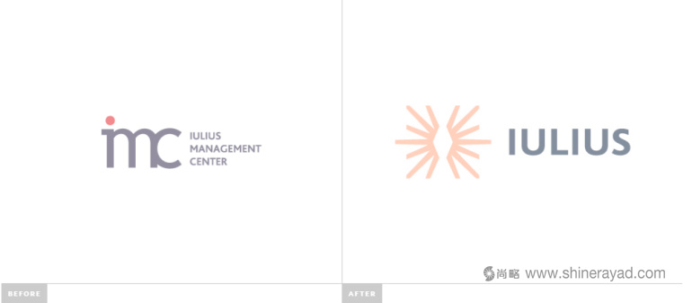
Romania, the old logo didn''''t do it much justice, looking more like some kind of
small research center inside a university. The execution of the acronym was terrible too, with a triple-threat
ligature that yielded an unpleasant whole. The new logo''''s focus is a shining icon
that — if you don''''t know it''''s based on Constantin Brancu?i‘s endless column — looks like a radiating diamond, which is
not a bad metaphor for a real estate developer. It''''s not the most fantastic
icon but it has a simplicity and an angular starkness
that indicates they mean business and quality. The wordmark is fine. The color
palette is a little weird… the flesh tone is not the most flattering; perhaps a
more salmon-esque color would have worked with the dark blue. Applications are
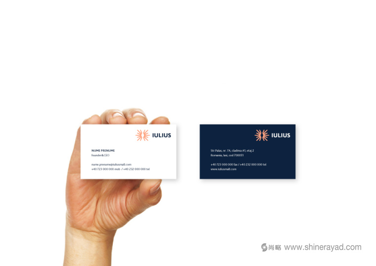
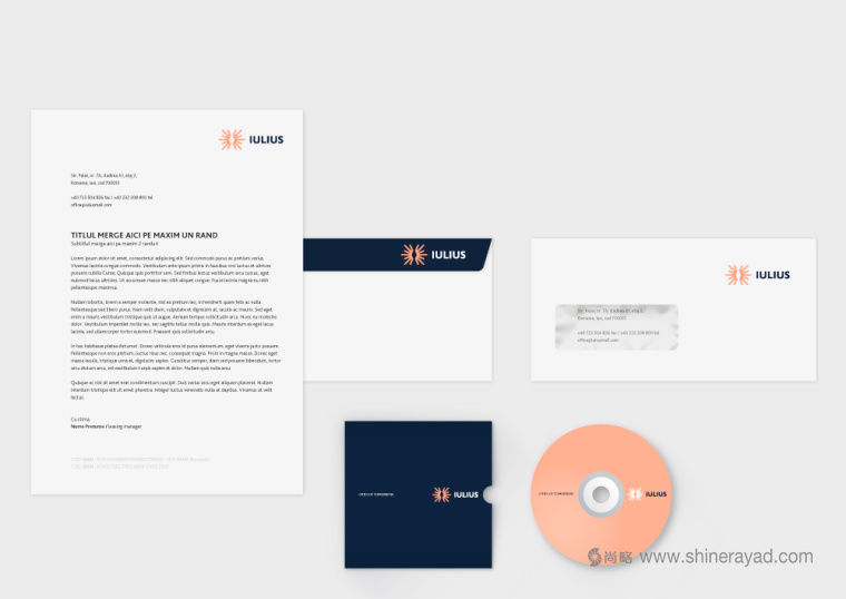
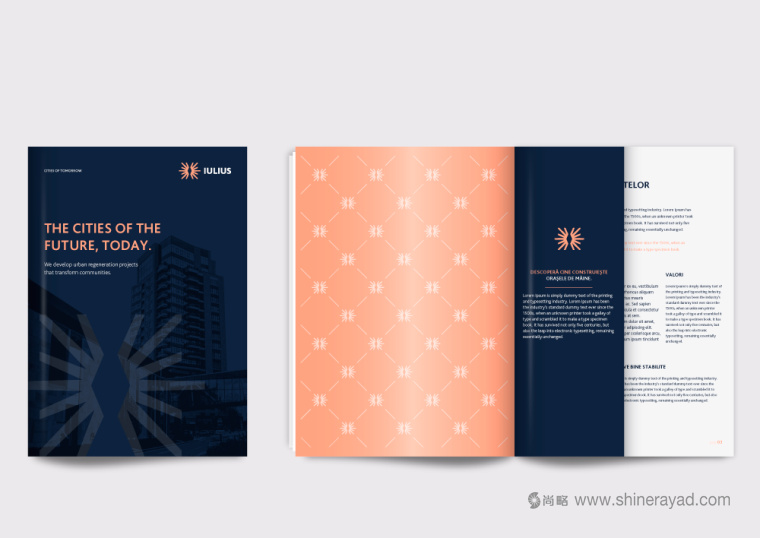
fine too; nothing too extravagant in the stationery but some more interesting things
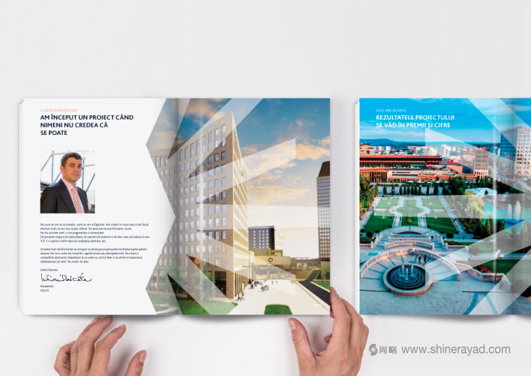
in the brochure like the repeating pattern. Overall, an improvement that makes
the company look much more legit and professional.
作為在羅馬尼亞最大的房地產(chǎn)商���,之前的Logo設計已經(jīng)不適用了,它看起來讓人感覺像是大學里的小研究中心�����?����?s寫也很嚇人�����,三個集結(jié)音符整體上很難讓人感到愉悅��。新Logo設計的重點是閃亮����。如果你不知道Constantin Brancu?i的無盡的柱子的話�,那新Logo看上去則是一顆亮晶晶的鉆石�。這對于房地產(chǎn)商來說不是一個太差的隱喻。它不是最好的Logo設計��,但是它很簡潔�,干凈的棱角象征著商業(yè)和高品質(zhì)。文字標志也很出眾�����。色調(diào)稍微有點奇怪����,肉色調(diào)不是最合適的�����,也許鮭魚風格的顏色會和深藍色更搭��。申請表格也很不錯����,信紙設計沒有很突兀的地方,員工手冊上有一些有趣的東西比如重復的圖案???a name="_GoBack">之,所有的改善都讓公司的整體形象看起來更正統(tǒng)更專業(yè)�����。
尚略上海品牌策劃設計公司快速導航: